
Opening look
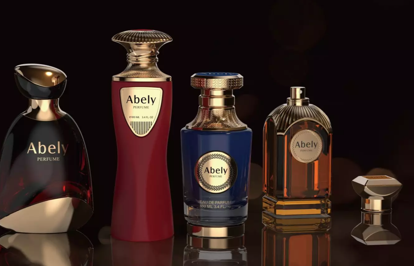
Color drives choice. This piece compares today’s leading hues and why they work for brands. It starts with applied design — from concept to final perfume bottle design. Trends you see on the shelf often echo shows like Paris Fashion Week and the post‑2020 push for sustainable sensibilities. These are the real cues shaping color use right now.
Why color matters
Color is shorthand. It signals mood, price point, and story in one glance. For small brands, a single tone can create recall. For legacy houses, a palette shift resets perception without rewriting the scent. Good color choices reduce friction in both physical retail and online displays.
Head‑to‑head: current trend comparisons
Here’s a quick comparison of the dominant color directions:
– Pastels vs. jewel tones: Pastels read soft and modern. Jewel tones read luxe and statement. Choose pastels for approachability; jewels for prestige.
– Matte blacks vs. high gloss: Matte feels contemporary and tactile. Gloss reads classic and reflective. Matte hides fingerprints; gloss highlights clarity.
– Warm ambers vs. cool translucents: Amber conveys warmth and heritage. Cool translucents suggest freshness and minimalism.
– Gradient and iridescence vs. solid color: Gradients add motion and depth. Solids ground the brand with a single, clear message.
Material and finish matter as much as hue
Glass weight, coating, and die lines change how color reads. A thin lacquer can mute a jewel tone. Heavy glass amplifies deep colors. Recycled glass often has a greenish cast — plan color around that. Metal caps and labels alter perception too; pair shiny metals with deeper tones and brushed metals with pastels.
Web and shelf synergy
Color must translate online. Product images need consistent color profiles. A brand font or CSS variable should match the bottle’s dominant hue. Small differences matter on mobile. Test swatches under natural and studio light. And ensure accessibility — contrast for labels and alt text for color cues help discoverability.
Common mistakes and smarter choices
Brands often make the same slips. They pick a trendy shade without testing physical samples. They forget how colors age under sunlight. They ignore how color interacts with fill color and cap finishes. Try small runs. Use prototypes. Iterate with both mockups and real glass — the two tell different stories. — Designers learn faster when they see and touch.
Comparing alternatives
If jewel tones feel heavy, consider tonal layering: a muted jewel wash over frosted glass. If pastels risk blandness, add metallic accents or embossing. When sustainability is a constraint, lean into natural hues that complement recycled materials. Each choice trades one benefit for another — clarity for warmth, novelty for longevity.
Takeaways for brands
Match hue to message. Test in real conditions. Coordinate online and offline palettes. Think holistically: color, material, finish, and secondary elements must align. This reduces rework and protects brand equity.
Three golden rules
1) Measure perception: run blind preference tests across markets. Use simple A/B with product shots and in-person samples.
2) Verify production fidelity: confirm color tolerances in glass batch runs and coating passes. Small variances scale into big mismatches.
3) Prioritize cross‑channel consistency: ensure digital swatches, POS, and packaging specs share the same color system and naming convention.
Final synthesis
Choosing the right colored bottle is a balancing act. You weigh brand intent, manufacturing limits, retail context, and online clarity. The best outcomes come from tight comparisons and fast prototyping — not guesses. When teams compare options side‑by‑side, they make clearer, faster decisions and protect brand value.