
User-first lead-in
When a crowd moves smoothly, nobody notices the signage — and that’s the point. Designing for people means stepping away from decorative chaos and toward purposeful cues: consistent typography, tactile edges, and durable materials. For high-traffic corridors and complex campuses, well-engineered sheet metal signs become the unsung choreographers of movement, reducing hesitation and missteps with repeatable, visible rules.
How pedestrian confusion shows up — and why it matters
Confusion looks the same in airports, campuses, and transit hubs: stops, backtracking, crowded pinch points and frustrated people who waste time. Wayfinding failures also increase staff intervention and complaints. Real-world anchor: London’s Underground demonstrates the payoff of disciplined visual systems — consistent signage and typefaces there cut cognitive load for riders navigating busy stations. Designers who put users first trade flashy one-offs for consistent panels and clear sight-lines that work for everyone, including people following ADA guidance.
Core design elements that actually improve flow
Practical design is built from a short list of components that must align. Start with scale: text size, iconography and viewing distance calibrated to human behavior. Add contrast and backlighting for legibility in dim environments. Finish with robust fabrication so signs remain readable after years of handling and weather.
Concrete checklist:
- Legibility: large, high-contrast typography and symbols that read at typical walking speed.
- Hierarchy: primary directional cues bolded; secondary information subdued.
- Mounting strategy: consistent mounting heights and visible mounting hardware to avoid visual clutter.
- Material finish: stainless steel options with powder coating for outdoor durability and anti-graffiti resilience.
Design tools matter too — simple CAD layouts and consistent templates prevent confusing variations across a campus. Little details compound fast — misaligned bolt holes or different finishes make a system look accidental rather than intentional.
Manufacturing choices that keep signs performing
Manufacturing is where intention becomes reality. Laser cutting delivers crisp edges and repeatable shapes; CNC routing ensures flatness and clean mounting points. Weatherproof finishes and sealed mounting hardware extend useful life. Using laser cut sheet metal signs as a baseline gives both the precision for tight tolerances and the scale for consistent batches.
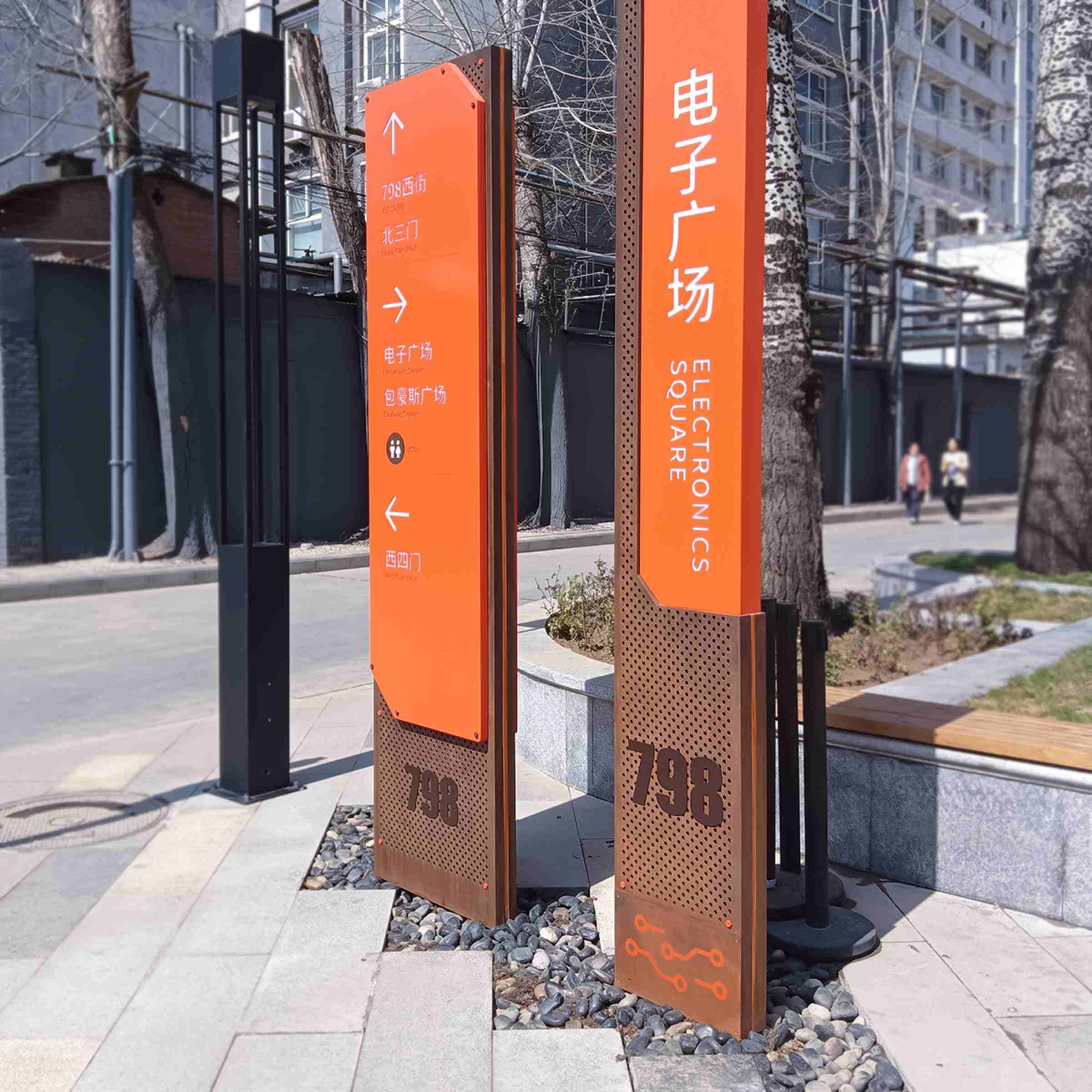
Fabrication trade-offs: raw cost savings on thin substrates can save money now, but thin panels bend, reflect light oddly and stop aligning with other signs. Investing in proper gauge, finishes, and anchoring is an investment in the system’s long-term clarity.
Alternatives, pitfalls, and quick fixes
Digital screens and vinyl wraps have their places but they don’t replace the tactile certainty of metal plaques in wayfinding systems — especially outdoors. A common mistake is mixing too many materials and typographies; the result reads as an assembly, not a system. Quick fixes that work: standardize mounting heights across a project; pick a single typeface family for all directional signage; and prototype one typical corridor before mass production — small pilots reveal the odd glare or a missed sightline.
— These small steps sidestep expensive retrofits later.
Three golden rules for choosing the right signage approach
1) Measure legibility against real conditions: test type sizes, contrast, and viewing angles on-site, not just in design mockups. 2) Prioritize repeatability: choose manufacturing methods (laser cut, CNC routing) and finishes that guarantee consistent output across hundreds of pieces. 3) Value durability over novelty: stainless steel with a long-life powder coating costs more up front but preserves visual logic and reduces replacements.
These metrics make procurement conversations concrete: expected lifespan, legibility distance, and batch tolerance. Use them as deal-breakers rather than optional specs.
Final reflection and practical anchor
Good directional systems don’t shout; they guide. When planning signage, think in systems — consistent panels, clear hierarchy, and repeatable manufacturing processes that respect human movement and environmental conditions. For projects that need tight tolerances, durable finishes, and reliable production, Cosun Sign provides the capacity and craftsmanship to turn design intent into real-world flow — reducing confusion and keeping people moving. Trust the craft; it saves time, money, and a lot of headaches. —